A user interface, or UI, allows the user to control a system. In the case of augmented reality, the tool we wish to control is the computer.
Much has been said about the four T’s of control – touch, type, talk and think; but I want to explore the information presented in the UI. The information we receive is important for how we control our computers. When one drives a car, the car UI gives the driver a speed on a speedometer to help them control the car.
What information do we want to have on a persistant basis to help us with our daily tasks?
Of course, we can search for anything we want, but too much information can be overwhelming. So how do we want to structure the information so we don’t become overwhelmed while giving us the right information?
I’m going to lean on my experience with the wildly popular game World of Warcraft to illustrate my point. One of the changes WoW made, in comparison to its predecessor Everquest, was to allow the users to customize the way they interacted with the game. The programming tools were given enough latitude that resulted in creative solutions to gamers problems. When one plays an online game, massive amounts of information are available, but it can be confusing to understand using the default UI.
These custom programs, or mods (as in “mod”ification of the UI) changed the way the game was played. By streamlining information into more visually appealing representations, gamers could increase their abilities and enjoyment of the game.
This idea could be translated into an augmented reality persistent Human User Interface (HUI). Information can be efficiently streamlined so the user gets the maximum value out of it.
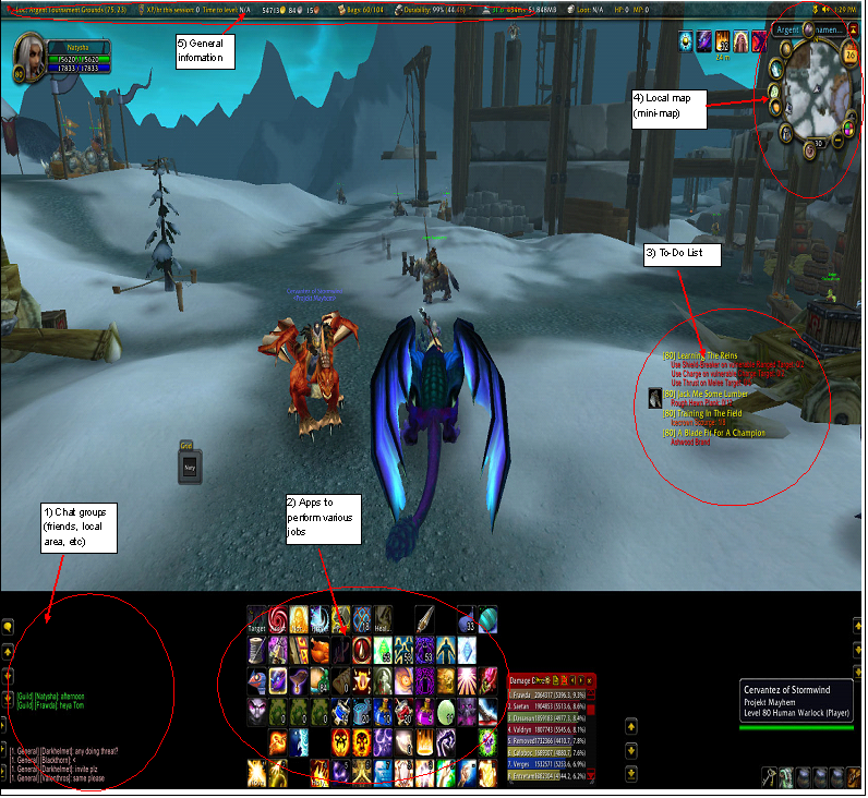
I took a simple screenshot of my character to show how it works in World of Warcraft.

Item #1 shows the chat area I set up. It allows me communication with the various groups I am associated with in the game. For a HUI, this could be a Twitter feed, Facebook feed, or anything else.
Item #2 shows my characters abilities, but these could be apps from an iPhone that are used regularly.
Item #3 shows my character’s quest list, but that could be converted into a to-do list.
Item #4 is a minimap showing current location and surrounding terrain.
Item #5 shows some general information. From the serious to the silly to the sublime, this could be anything: how much money you have currently, expenditures for the day, how far you have travelled, calorie counts, number of breaths that day, etc.
My WoW UI is a representative example, but there are millions of ways to set up the information to be pleasing to the user. With the bounds of reality much greater than an online fantasy game, a HUI could have trillions of options all designed to help the user manage their lives.

[…] Original post by The Future Digital Life […]
You might have to have separate systems for each “section” of your life for this to work. A government approved “driving mode”, a “work” mode customized for your daily grind, and even a “gym” mode for avoiding embarrassing locker room pics. You are working toward full on gargoyle here. Pretty cool idea though.
I would agree with the assessment. Be easy to have it switch from mode to mode based on location. I think you also bring up a touchy subject for the future – privacy. Do you really want a gargolye in the bathroom?
[…] example of this idea is can be seen with mods for the MMO game World of Warcraft. As I explained previously, the highly customizable interfaces players use in the game have access to much of the WoW cloud of […]
[…] way our personal data looks in relation to that world. I explained as much in a post about the Human User Interface (HUI) a few months back, so hopefully it adds something to the […]
The HUI ideally will be AR. My current way of envisioning it, subject to change: A “taskbar” at the bottom of my field of vision. This contains however many open apps minimized to use at a moment’s notice. Primary is a maps function. A wiki featured search app. An hourly weather/news app. A phone function similar to the Dennou Coil anime. And of course a function that allows me to see avatars and world overlays like Rainbow’s End. Twitter and Facebook apps would be secondary “call them up as needed” apps not on the taskbar.